Sharp Magazine

Summary
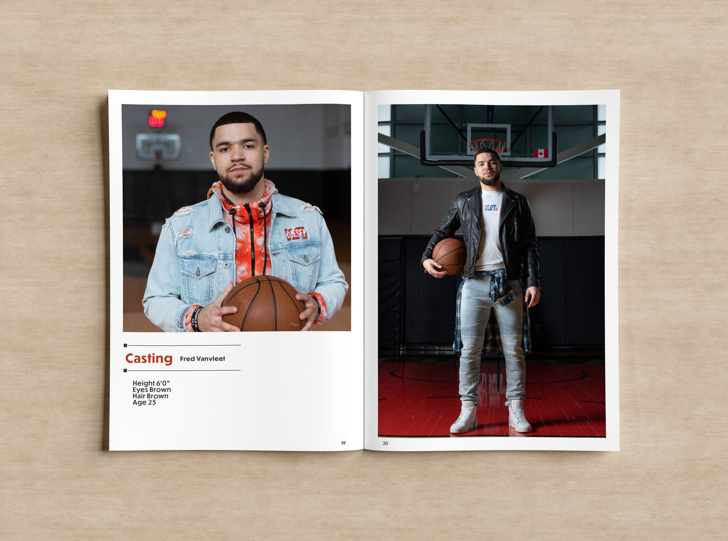
My role encompassed full art direction and editorial layout across all three categories. I created detailed magazine spreads that integrated brand-consistent typography, gridded layouts, and structured modular design to guide the reader through each section seamlessly. From the moody, cigar-lounge vibe of the Smoke Room layout, to the clean, tech-forward structure of Smart-Home Gear, and finally to the documentary-style presentation of Raptors in T.O., each section was treated with a unique but cohesive visual tone. The deliverables included moodboards, casting specs, layout systems, and product design treatments.
Challenge
One of the main challenges was balancing three distinct editorial themes within one cohesive magazine system. Each category had very different tones: the Smoke Room called for a rugged, masculine elegance; the Smart-Home section demanded modern simplicity and clear information hierarchy; and the Raptors in T.O. piece needed to feel personal, street-level, and cinematic. It was also a creative challenge to map out a consistent layout structure that supported a clean flow while still adapting to different types of content — products, tech diagrams, fashion photography, and casting bios.
Solutions
To unify the editorial while allowing each category to breathe, I built a strong modular grid system that could adapt to image-heavy spreads or more typographic layouts. For the Smoke Room, I leaned into deep tones, leather textures, and serif/sans-serif combinations that evoked a high-end cigar lounge. In the Smart-Home layouts, I used clean spacing, product-centered framing, and warm tech tones to create a sense of accessibility and ease. For Raptors in T.O., the layout referenced vintage photojournalism with full-bleed portraits and clear casting specs, paired with subtle nods to street fashion and urban storytelling. Each section used its own voice — but the framework kept the overall design system grounded and consistent.
Magazine Layout
Toronto, Ontario
2021
This editorial project was created for Sharp Magazine, a men’s lifestyle publication focused on aspirational living. I developed a multi-part product editorial that combined layout design, casting vision, and mood direction. The magazine features three distinct sections: luxury seating for smoke rooms, smart-home technology guides, and a fashion story featuring members of the Toronto Raptors, shot in the city


