BOOTLEGG

Summary
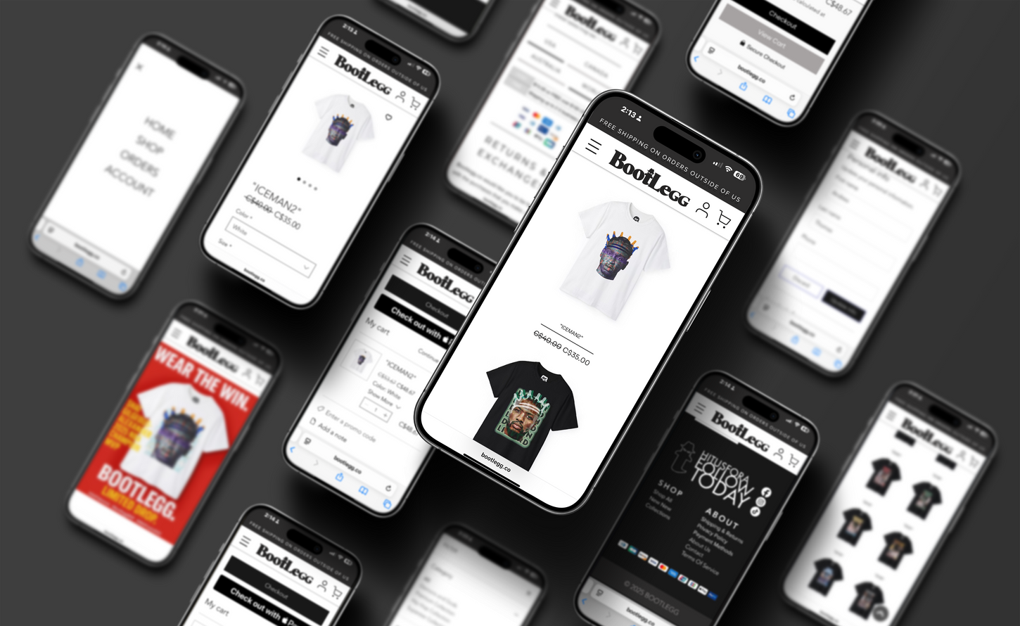
I joined BOOTLEGG at the foundational stage of the brand’s development, working alongside the founder to translate their ideas into real, functional design. My responsibilities included building the e-commerce site, designing their clothing drops, creating a visual language based on there core values and producing social media ad content. The project was fully collaborative, allowing me to contribute across multiple channels — from apparel to interface design — while aligning closely with the brand’s rebellious, art-driven tone.
Challenge
Bootlegg came to the table with a strong, gritty aesthetic — think DIY textures, underground visuals, and a rebellious tone — but none of it had yet been formalized. One of the first challenges was translating that raw energy into a clear, repeatable system that could live across web, apparel, and marketing without losing its edge. The brand needed consistency, but not at the expense of personality.
Another major challenge was tied to production: the garments would be DTG printed, but the goal was to make them feel like one-off screenprints — worn, imperfect, and analog. I had to develop design treatments that mimicked the tactile flaws of physical printing using only digital tools. That meant building layered, distressed textures that held up in print but still looked intentional on screen.
On the web side, I had to strike a balance between bold brand expression and real functionality. Bootlegg’s identity is loud — by design — but the site still had to sell product. Navigating how to incorporate heavy visuals without sacrificing clarity or speed was a constant push-pull.
Finally, as a solo designer on the project, I had to wear every hat: building the site, designing the clothing, developing the look and feel of the brand, and producing ad creative. It was fast-paced and hands-on, but the creative alignment across all channels made it worth it.
Solutions
Despite the demands, the end result was a fully realized brand with a clear voice and presence — gritty, intentional, and unmistakably Bootlegg. The visual identity I helped shape became the throughline for every touchpoint, from the nameplate logo to the web layout and the t-shirt graphics. What started as a raw concept turned into a cohesive system that could flex across collections, marketing, and digital storefronts without losing its edge.
The Framer site is clean, responsive, and tailored for limited drops — stripped back enough to keep the focus on product, but still infused with personality. Users can browse, shop, and check out smoothly, with zero friction — and the brand tone still hits loud from the first click.
On the product side, the graphic tees launched with a distinct visual language. Each design looks and feels like a collectible — layered, textured, and different from anything mass-produced. The print strategy paid off: even though the production method was digital, the designs captured the imperfect charm of hand-pulled screenprints.
Most importantly, the work held together across platforms. Whether it was a product page, an Instagram ad, or a piece of packaging — everything spoke the same language. Bootlegg now stands out in a saturated streetwear space not just because of what it sells, but because of how consistently and confidently it shows up.
Brand & Identity Design
Clothing Design
Social Media Marketing
Web Design
Package Design
Managing Store Preferences
Victoria, British Columbia
2024
Bootlegg is a streetwear brand blending modern drop culture with gritty 90s bootleg aesthetics. I was brought on early in the project to help bring the brand’s vision to life across web, apparel, and marketing design. From developing the visual identity system to designing the online store and crafting textured, screenprint-inspired t-shirts — I played a hands-on role in shaping how the brand looks, moves, and sells.


